X Close
Top

Welcome to the new Eagle Mountain

Eagle Mountain – Ascend Together

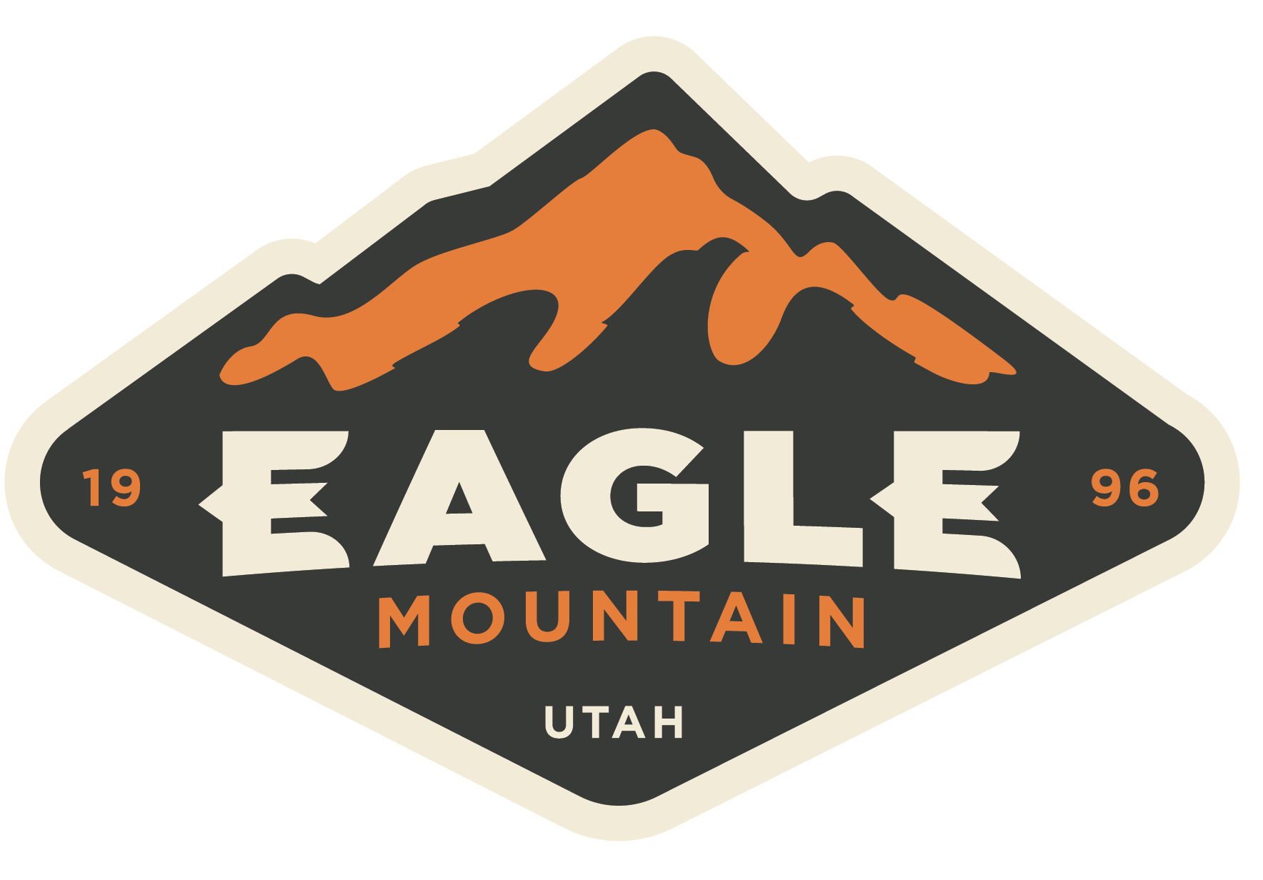
At Eagle Mountain City, we are thrilled to unveil our brand new identity that encapsulates the very essence of our vibrant community. Our refreshed logo and sublogo, lovingly known as the “E,” symbolize the unique character and aspirations of our community.

The Main Logo: A Tapestry of Inspiration

Drawing from Nature: Inspired by the awesome beauty of our surroundings, Eagle Mountain City’s main logo pays homage to America’s National Parks. Its design reflects our commitment to preserving and celebrating the natural wonders that make Eagle Mountain a haven for outdoor enthusiasts of all types.

While most municipalities gravitate toward colors like blue or green, Eagle Mountain wanted to set itself apart from other cities in Utah. The orange color indicates several things: it’s warm and inviting, it represents evening and the outdoors, the rust color of the orange is vintage and is designed to last more than a decade.

Native American Symbolism: Embedded in the logo is a nod to the rich heritage of the Cedar Valley. The indigenous-influenced design is a tribute to the history and cultural tapestry of this area in Utah, particularly, the Fremont peoples.

New Heights: The Eagle represented in the negative imagery of the mountain is more than just a pleasing picture; it signifies our community’s upward trajectory. Like an eagle taking flight, we are a city that is ascending – embracing challenges, and charting a course toward a bright future.

What the Logo Represents:

  • Community: The intertwined elements of the logo reflect the unity and strength that define Eagle Mountain City. Together, we stand as a resilient and close-knit community.
  • Outdoor Destination: The City’s new branding proudly declares Eagle Mountain as an outdoor destination, inviting residents to explore the scenic wonders at their doorsteps.
  • Heritage and Tradition: Cherishing the past while looking towards the future, the new logo blends modernity with the deep-rooted traditions of the land, creating a brand that resonates with our shared history.


The "E" Sub-logo: Hidden Depths

The “E” sub-logo emerges as a multifaceted symbol, seamlessly blending the representation of a letter with the spirit of an eagle. The design holds a story within its lines, inviting residents to discover the nuances that make Eagle Mountain truly unique.

A Letter, a Symbol, an Eagle’s Flight

The “E” as a Letter: At first glance, the “E” stands proudly as a letter, signifying the very name that binds us together – Eagle Mountain. It’s a bold declaration of our identity, easily recognizable and etched into the fabric of our community.

An Eagle Takes Flight: At closer look, you’ll witness the “E” transform into the wings of an eagle, conveying freedom, strength and the independence that defines our city. It’s not just a letter, it’s a symbol of aspiration and unity.

The Tail Becomes the “M”: The subtlety of design takes flight as the tail of the eagle can be spotted as the letter “M.” This integration subtly spells out the City’s full name, creating a harmonious fusion of symbolism and identity. The “M” reinforces our place – Eagle Mountain – and becomes a distinctive mark that sets us apart.

Embracing the “E” Spirit

As you encounter the “E” sub-logo across Eagle Mountain City, take a moment to appreciate the artistry and thoughtfulness woven into its design. It’s more than just a symbol; it’s an invitation to connect, explore, and embrace the spirit of Eagle Mountain.

Celebrating the Journey

As we embrace this new chapter, we invite each resident to be a part of this exciting journey. Explore our website, engage with the community and discover the myriad opportunities that await you in the heart of Eagle Mountain City.

Let’s Ascend Together!


Follow Us

  • Issue Reporting Hotline:
  • 801-789-5959
  • Option 1 – Parks and Recreation
    Option 2 – Water
    Option 3 – Sewer
    Option 4 – Storm Water
    Option 5 – Streets
  • For Emergencies, dial 911